Visualizing 200 Years of Stock Market History

https://www.visualcapitalist.com/200-years-u-s-stock-market-sectors/)
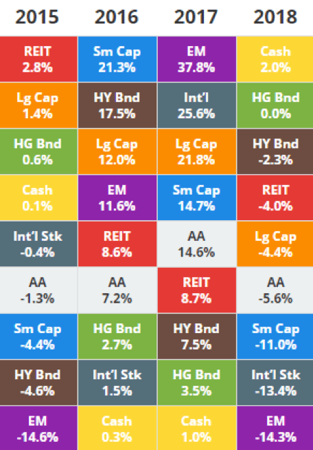
Each quarter we give our clients the chance to huddle together and receive some analysis regarding what transpired in the U.S. markets in the proceeding quarter. One of the staples we like to share is how the major asset classes performed and compare it trailing performance during recent years (like this chart below). It is always interesting to see how much fluctuation there can be in short period of time. For example, notice 2017’s leading sector of “Emerging Markets” fell completely to the bottom in performance in 2018 while “Cash” demonstrated the inverse.

(source = https://novelinvestor.com/asset-class-returns/)
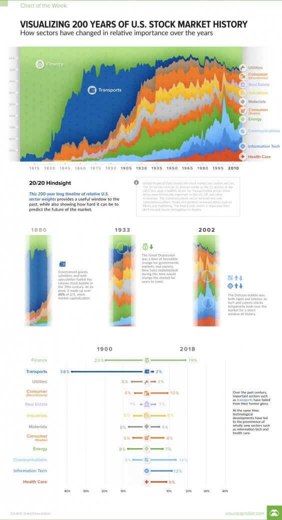
An entirely new perspective comes to light when the concept is explored over a measure of centuries versus just recent years. Visual Capitalist recently posted “Visualizing 200 Years of U.S. Stock Market History”.

On one hand there has been some seismic changes. In 1900 “Transports”, which mostly translates to “railroads”, represented 38% of the stock market capitalization. In 2018, transports represents only 2%. In 2018 “Information Tech” and “Health Care” combine to almost 20% market capitalization. These are two sectors that didn’t even exist until about the 1920’s and barely moved the needle until the 1960’s.
Contrast that to some of the staples that have stood firm over the span of several decades. “Finance” was attributed to about 20% market cap in 1900 and 19% in 2018. Utilities, Real Estate, Consumer Staples and Energy are all examples of sectors that have only fluctuated a few percentage points. Exploring charts like these make for some fun trivia and stokes the fires of curiosity about what new sectors may exist a hundred years from now and which ones will fade away.


